Signal 2018
Design lead for Signal 2018 – Twilio’s annual conference AKA Disneyland for developers.
Redesigned the Signal brand for 2018 and all future conference experiences,
from website to event space, launching a new VIP program to interactive & hackable swag.

Hackpack V.4
Signal Pong

Voting

Shirt Factory

Role
Identity design | Brand strategy & development | Web design | Experience design | User interface design | Prototyping | Illustration
Context
Since TwilioCon in 2011, to Signal 2017 , Twilio’s customer and developer conference has had a different look and feel. In 2018 we made the decision to rebrand Signal, establishing a new look and feel that will be implemented for years to come.
Influence & Inspiration
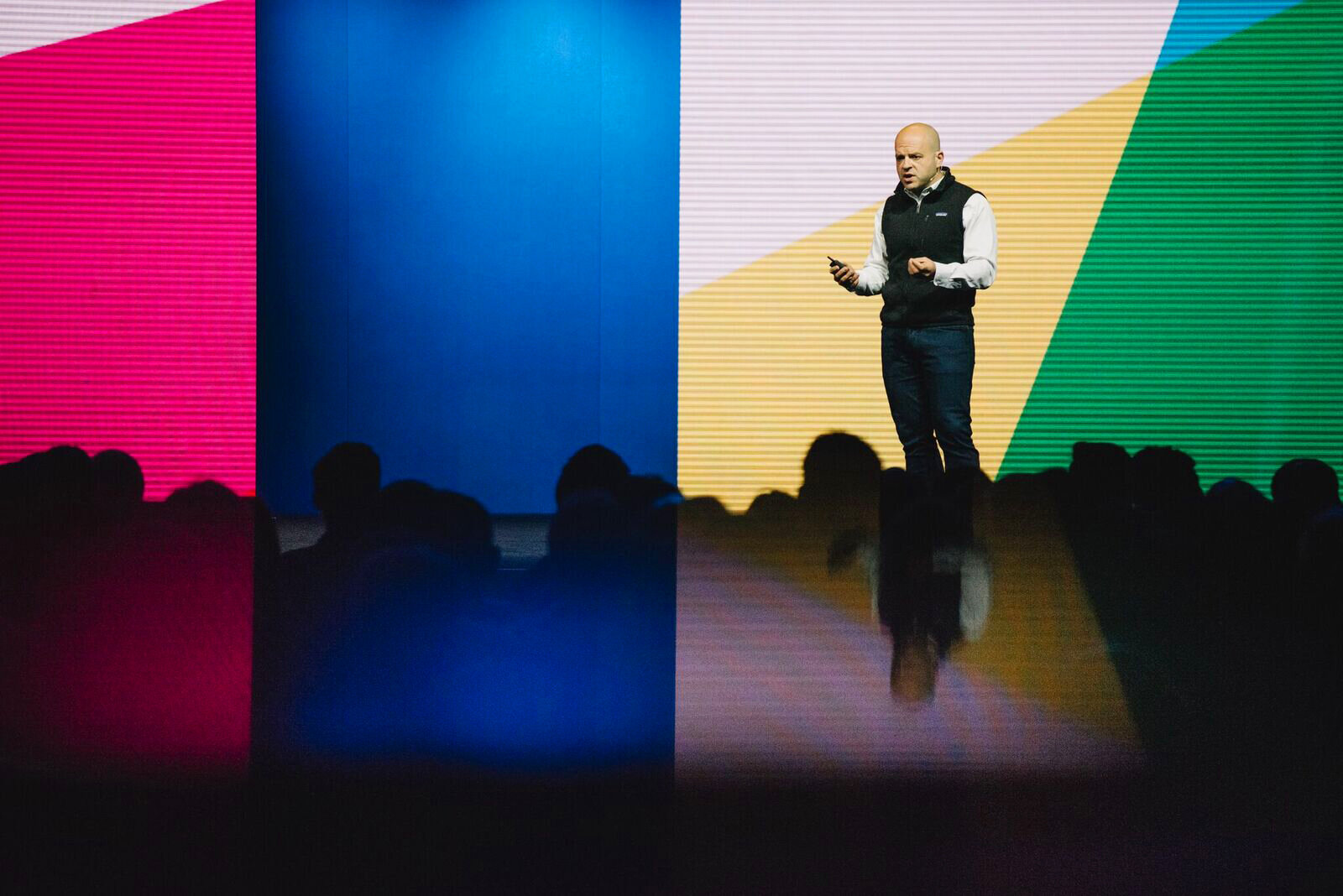
When doing a walkthrough of the Bill Graham Civic Auditorium I noticed how some areas were particularly dimly lit, which led me to use explore using bright and saturated colors. I ended up selecting colors that emulate the colored shadows cast by the colored spotlights used on stage.
The colored shadows are the result of “additive mixture” #science. White light is the sum of intercepting colored lights, but when any of the colors are obscured, the remaining colors cast a colorful shadow.

Logomark
This logo was specifically designed for Signal 2018, and the Signals of the future. True to the concept of colored spotlights, the logo could be represented in a number of colors, across all mediums. The logo found its way onto advertisements promoting to conference, signage throughout the event space, presentations, and swag!

CMYNavy
Color is a strong brand identifier, it provides contrast and helps define hierarchy. I started with Cyan, Magenta, and Yellow. The overlapping colors created a Purple, Green, and Twilio’s Red. Instead of black for when all colors overlapped, I used Twilio’s Navy.
This allowed the team and I to have a vibrant color palette which brought life to the dimly lit venue.

Abstraction
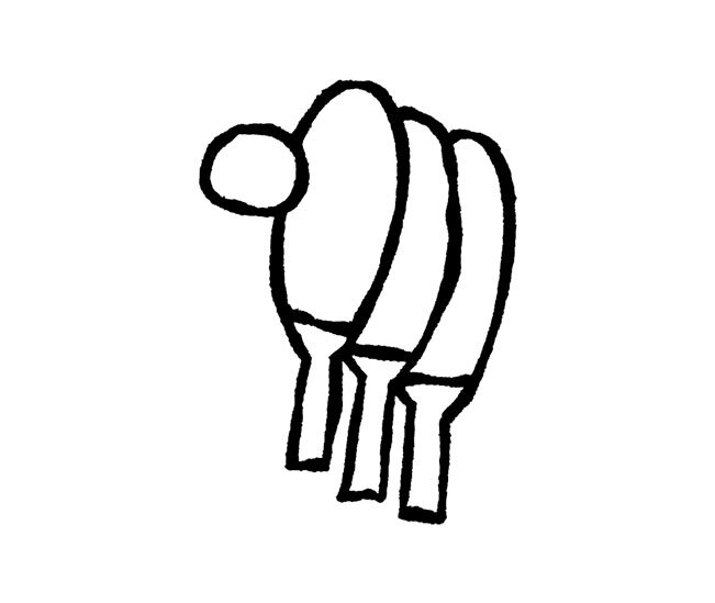
A series of duo-toned glyphs were created for Signal, a visual break from the saturated colors to provided a little contrast. It was from the glyphs where I extracted the abstract shapes throughout all applications. Every giant band of color is just a close up cropping of one or more of the glyphs in action. Apart from the glyphs created from the alphabet, there were also event specific glyphs for Superclass, Hackpack.cc, and for the band OK GO.

OK GO
OK GO played a big part in Signal 2018, with live performances using Twilio’s API as a musical instrument.
Using the glyph system I created OK GO’s Signal logo, and stage graphics that accompanied the band as they performed on stage. The simple alphabet glyphs and color palette even allowed for some exciting motion graphics!


Website
The Signal website was the biggest avenue that drove attendee signups. Rather than using the design elements of the main Twilio website, we opted for a completely redesigned website to deliver a consistent brand experience.
The key consideration was to present the packed schedule and all the information as clearly as possible.