
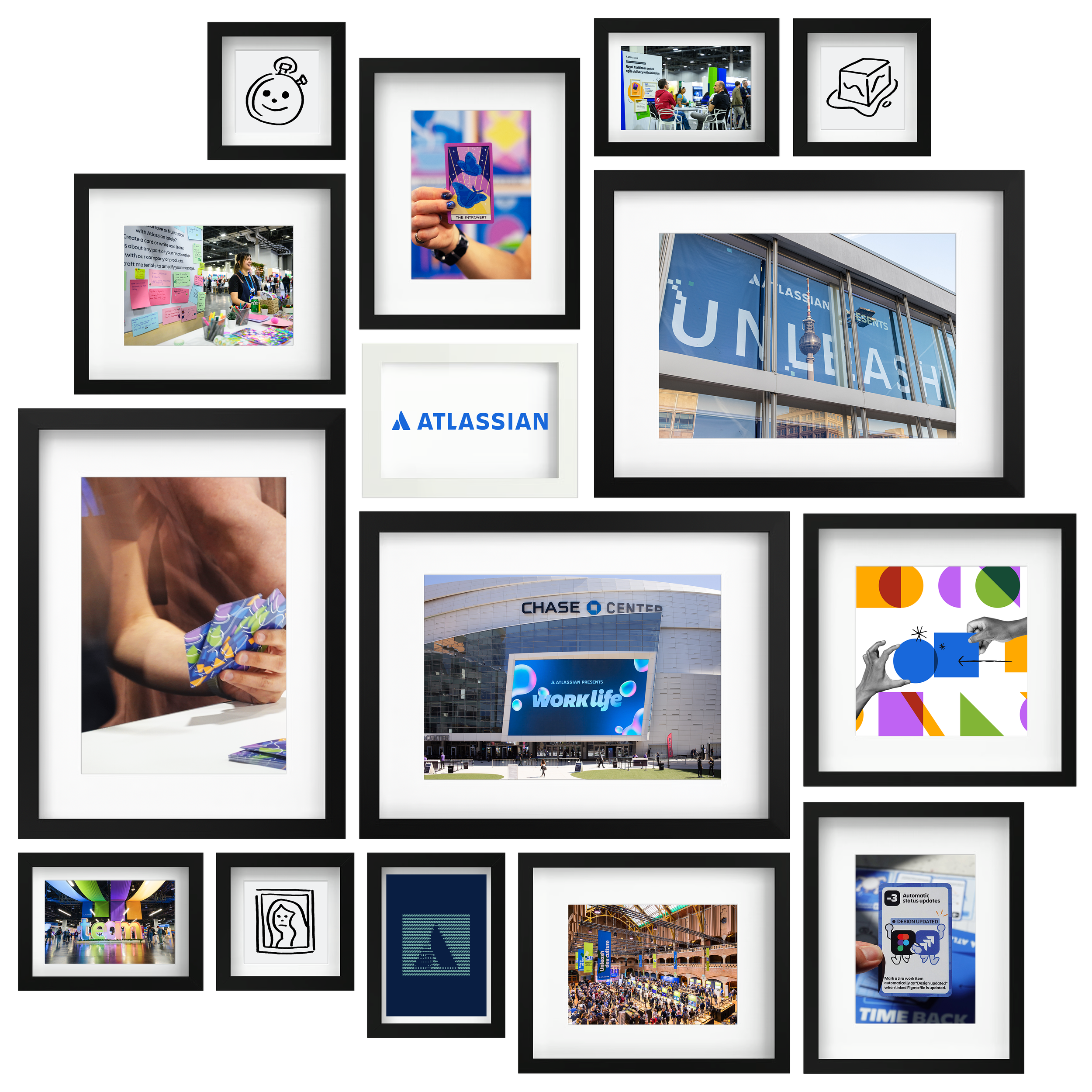
I lead strategic planning and art direction for Atlassian's comprehensive events portfolio, spanning flagship customer events, industry activations, and internal experiences. Working with the events marketing team, I drive end-to-end event experiences from ideation through execution, developing campaigns, web experiences, and motion/broadcast/environmental graphics.
Bringing together diverse teams across the organization to create cohesive experiences that advance Atlassian's mission of human collaboration; I partner with brand and product teams to develop new visual identities while maintaining brand consistency, continuously evolving our visual language into compelling interactive experiences.

I lead comprehensive art direction and design for Intercom's multi-channel marketing campaigns while strategically leveraging their established and recognizable brand identity.
I collaborate closely with writers, motion designers, and marketers to develop compelling creative for new product launches and ongoing initiatives. Additionally, I art direct external agencies on campaign production and internal event experiences, ensuring brand consistency across all touch points while contributing to the brand's continued growth and market presence.

I collaborated with cross-functional teams of designers and developers across all of Twilio's visual and branded properties, collectively owning the company's brand and voice across multiple platforms—from website and digital experiences to in-person events and physical office spaces.
At Twilio, we prioritized thoughtful and engaging design that simplified complex technical product offerings while authentically highlighting our vibrant company values and culture. Our team's work consistently aimed to bolster human communications while empowering developers to build innovative solutions for the future.
Through deep immersion with developers, developer advocates, and our broader developer community, I gained invaluable insights into diverse programming languages and their unique communities. This experience provided me with a comprehensive understanding of the shared experiences and cultural nuances that define the developer community at large.

As my first introduction to an in-house marketing team and entrance into the technology industry, I led Bluecore's comprehensive visual design across both Product and Marketing initiatives. I refined and designed Bluecore's digital and print materials to communicate the company's strategic positioning and value proposition.
This role provided me with the opportunity to collaborate extensively with cross-functional teams throughout the organization, from sales and recruiting to product development, helping determine specific business needs while ensuring consistent brand messaging and visual identity across all of Bluecore's customer and internal touch points.

At NSG/SWAT, I collaborated closely with a tight-knit team of Copywriters, Designers, Art Directors, and Developers, building strategic creative solutions while providing clear direction and constructive feedback across all projects. Working with a diverse range of brand clients, I served as the standard bearer of our clients' brand messaging and visual identities, ensuring consistency and authenticity in every deliverable.
I directed photo-shoots, provided comprehensive video direction, and assisted with technical supervision to guarantee that final production deliverables matched our proposed creative concepts. I worked closely with Account Managers and Strategic Planners to ensure all creative concepts remained on-brand and strategically consistent, fostering collaborative relationships that elevated both creative output and client satisfaction in our close-knit studio environment.

At Havas Worldwide, I had the opportunity to conceptualize and create intuitive and engaging brand experiences for established household legacy brands, transforming complex messaging requirements into highly compelling and memorable design concepts that resonated across diverse audiences.
I collaborated closely with multidisciplinary teams including Art Directors, Copywriters, UX Architects, and Creative Directors to launch new products through various media channels; from recording radio commercials and developing print advertising to exploring emerging social media marketing strategies during its early adoption phase.
I was also fortunate to participate in international product launches spanning multiple markets and regions, contributing to comprehensive advertising localization campaigns that required cultural sensitivity and strategic adaptation to ensure brand messaging translated effectively across different global audiences and market conditions.